

Reinstilling trust in a broken time clock system
DESKTOP, TABLET, MOBILE | B2B SAAS PLATFORM
PROJECT OVERVIEW
TIMELINE
3 Months (March - May 2021)
ROLE
Lead Product Designer
TEAM
2 Product Designers
1 Strategist
1 Product Manager
5 Developers
DEVICE
Web
Tablet
Mobile
CHALLENGE
After facing a costly lawsuit due to inaccurate time cards, PorterMatt Electric Inc. was on a mission to build a proprietary time clock & tracking system called ShadowShifts. Our team was tasked with building out the MVP within 3 months for three user groups: administrators, foremen, and crew members.
RESULTS
A faster, simpler, time tracking system on three devices, for three distinct user groups, in just under 3 months.
The application is currently in development and scheduled to be completed in September 2021.
PROBLEM
A $1M lawsuit and an unreliable, error-prone time tracking software
When PorterMatt, Inc. faced a costly class-action lawsuit, they switched from manual time cards to their current, customized time tracking software. Their current system, however, still contained numerous problems: long loading times due to massive technical debt caused a slew of related issues such as incorrect clock punches and break violations. Technical issues aside, the current system’s unreliable nature had created distrust in the time tracking data itself. These issues had a direct consequence on the business:
“There are guys that are 5 minutes late, they wont be reporting it because it is too much of a hassle. And we are losing money there too.”
SOLUTION
A product that takes the guesswork out of clock-in procedures
Because I was creating three solutions for three different users in parallel, I was able to design an intuitive solution that removed most clock-in errors faced in the current system, thereby reducing significant hours of work for administrators spent correcting time cards.
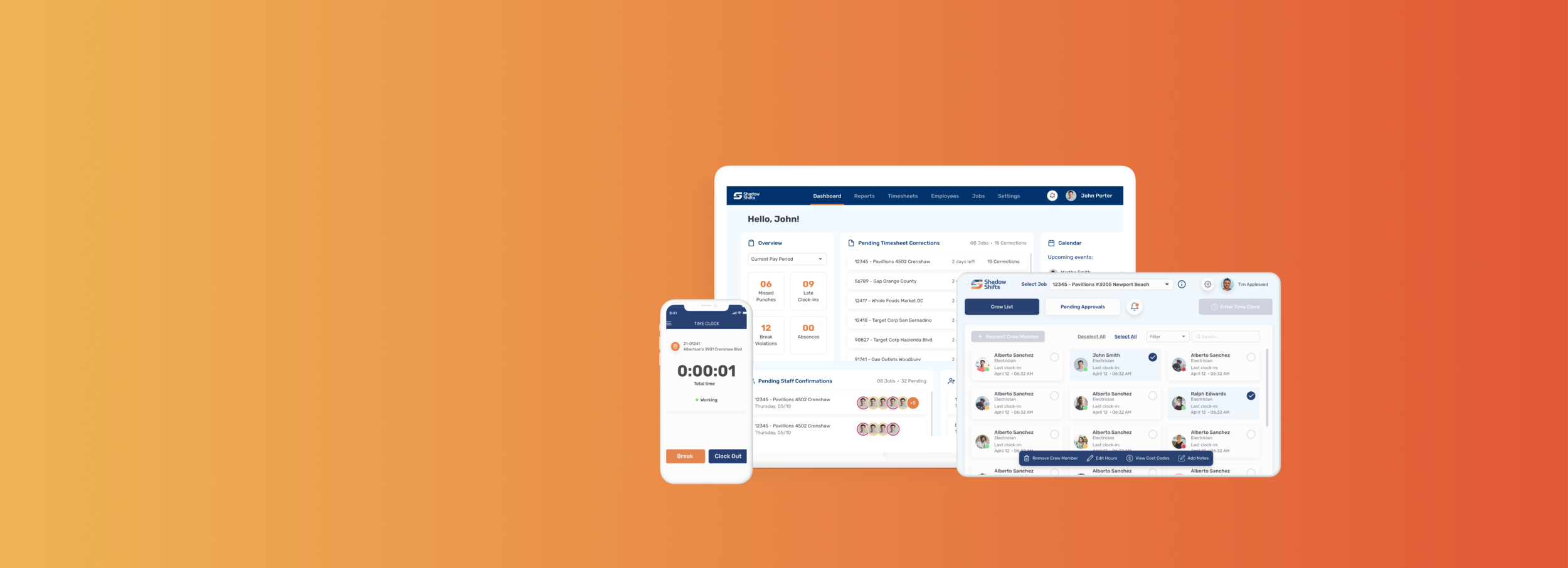
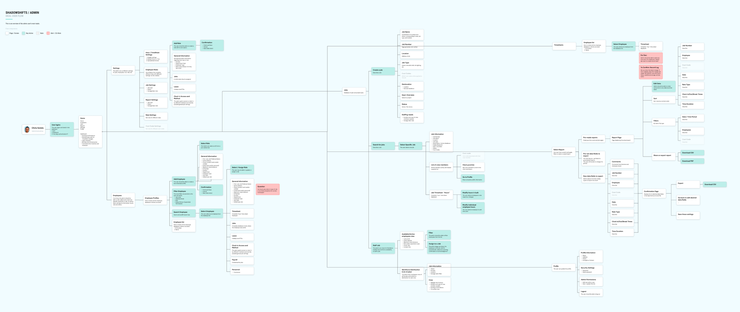
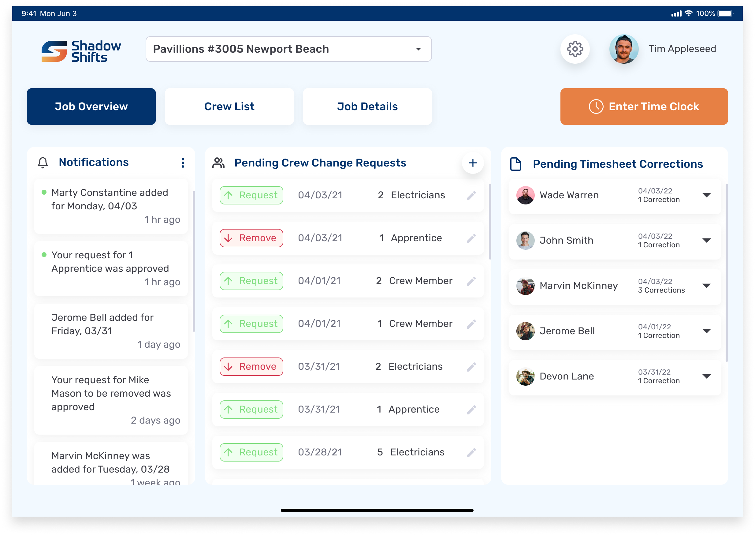
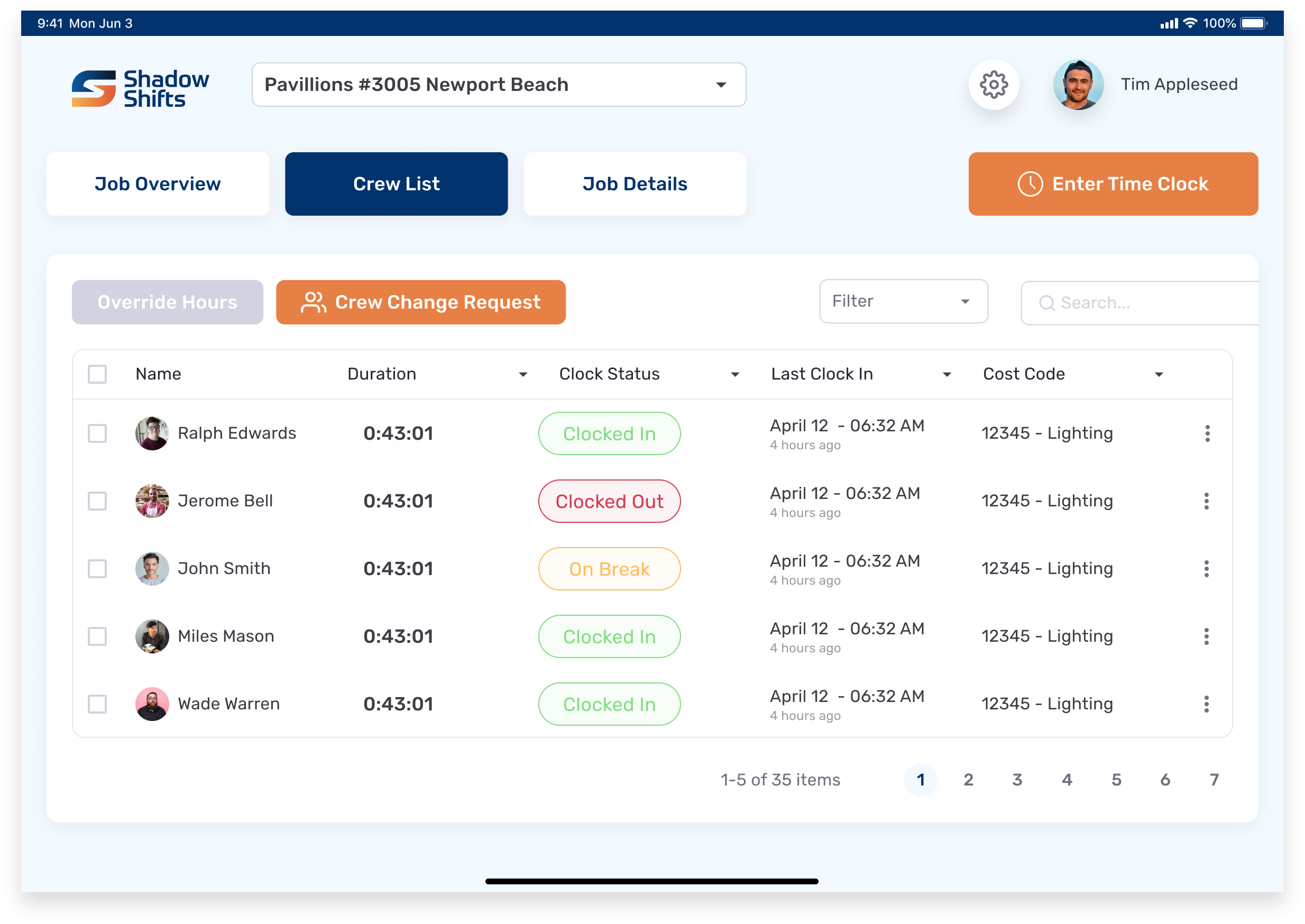
ADMINISTRATOR | DESKTOP
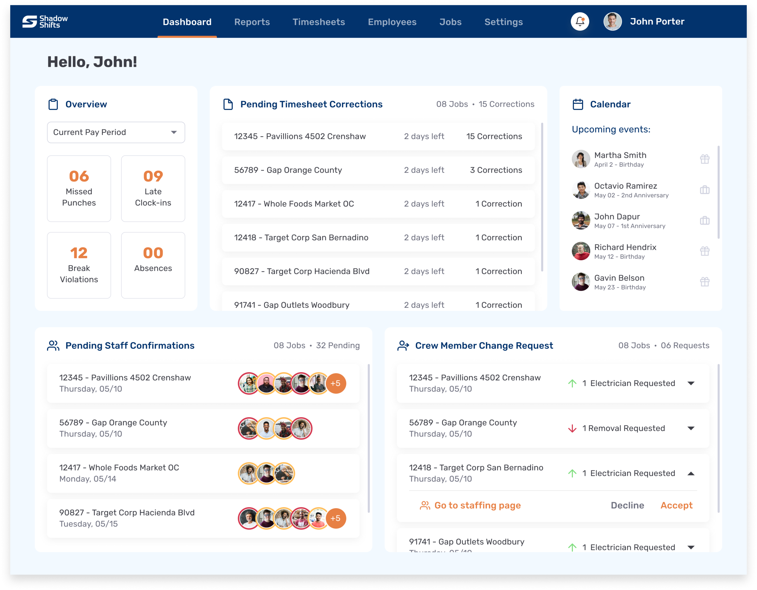
Timesheet corrections
Timesheets needing corrections and crew member changes are requested by the foreman and sent directly to the administrator, reducing hundreds of emails that only get lost in the administrator’s inbox.
In-app shift confirmations
Administrators no longer need to text or follow up with every crew member for a shift change.
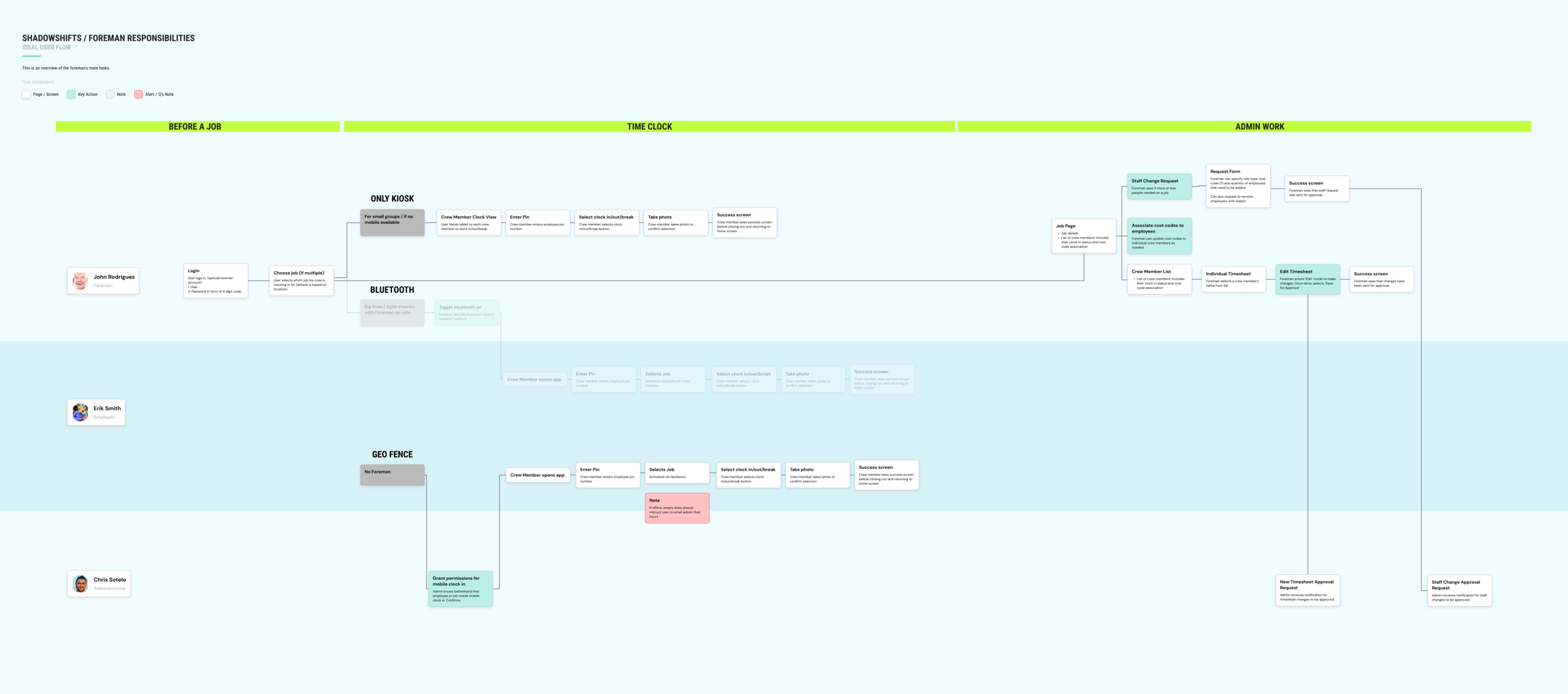
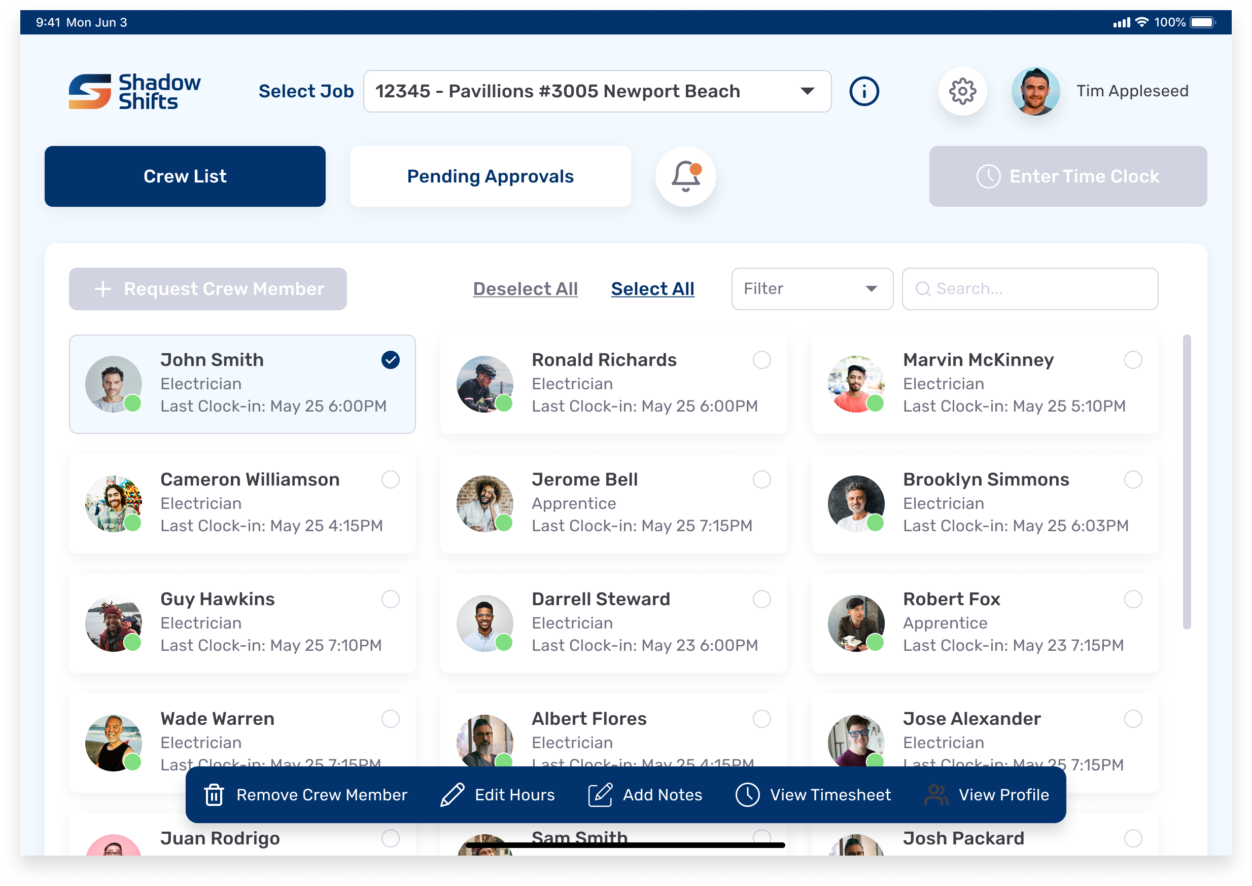
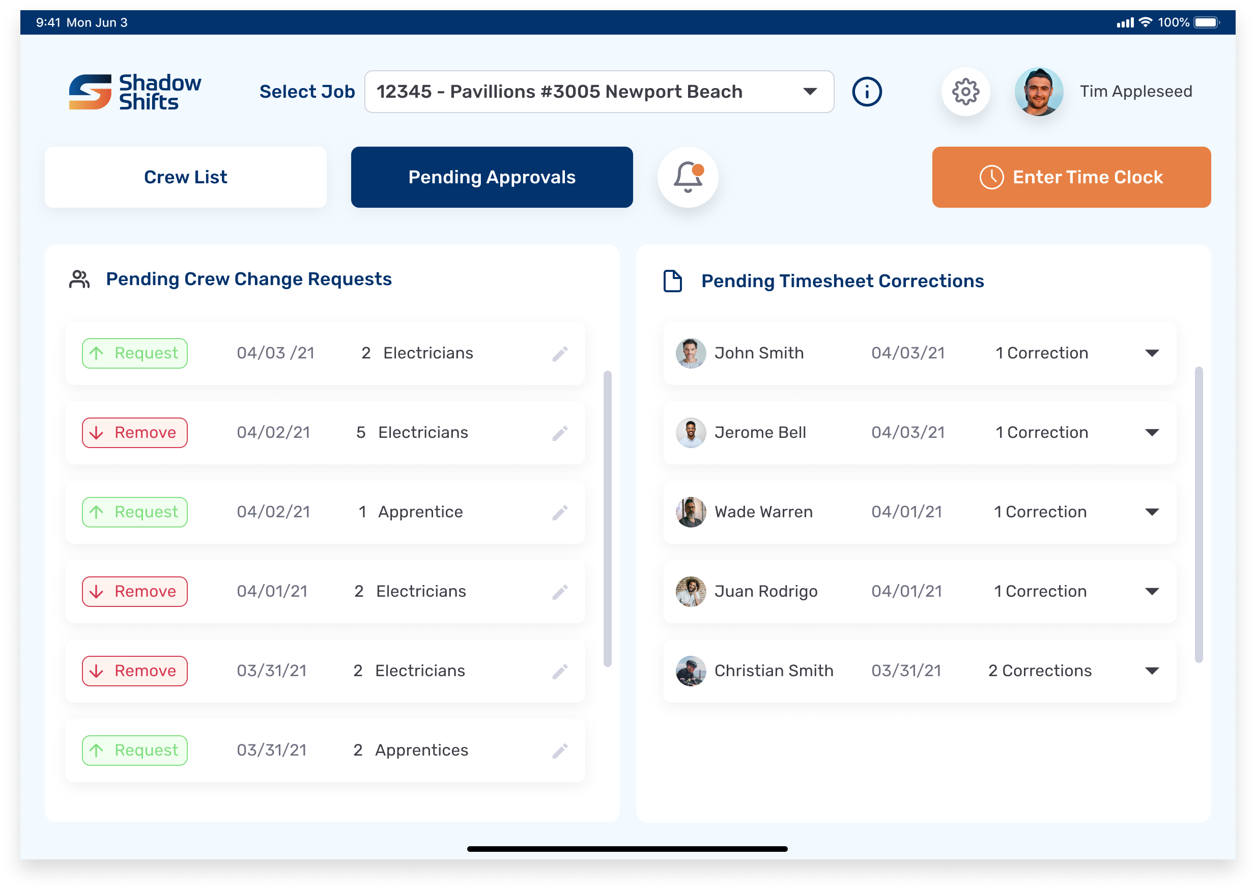
FOREMAN | TABLET
Crew List Overview
Foremen now get an overview of their crew and can perform a number of actions: requesting or removing crew members, view and send timesheet corrections for approval, and add notes for each member.

CREW MEMBER | MOBILE
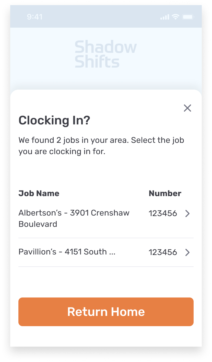
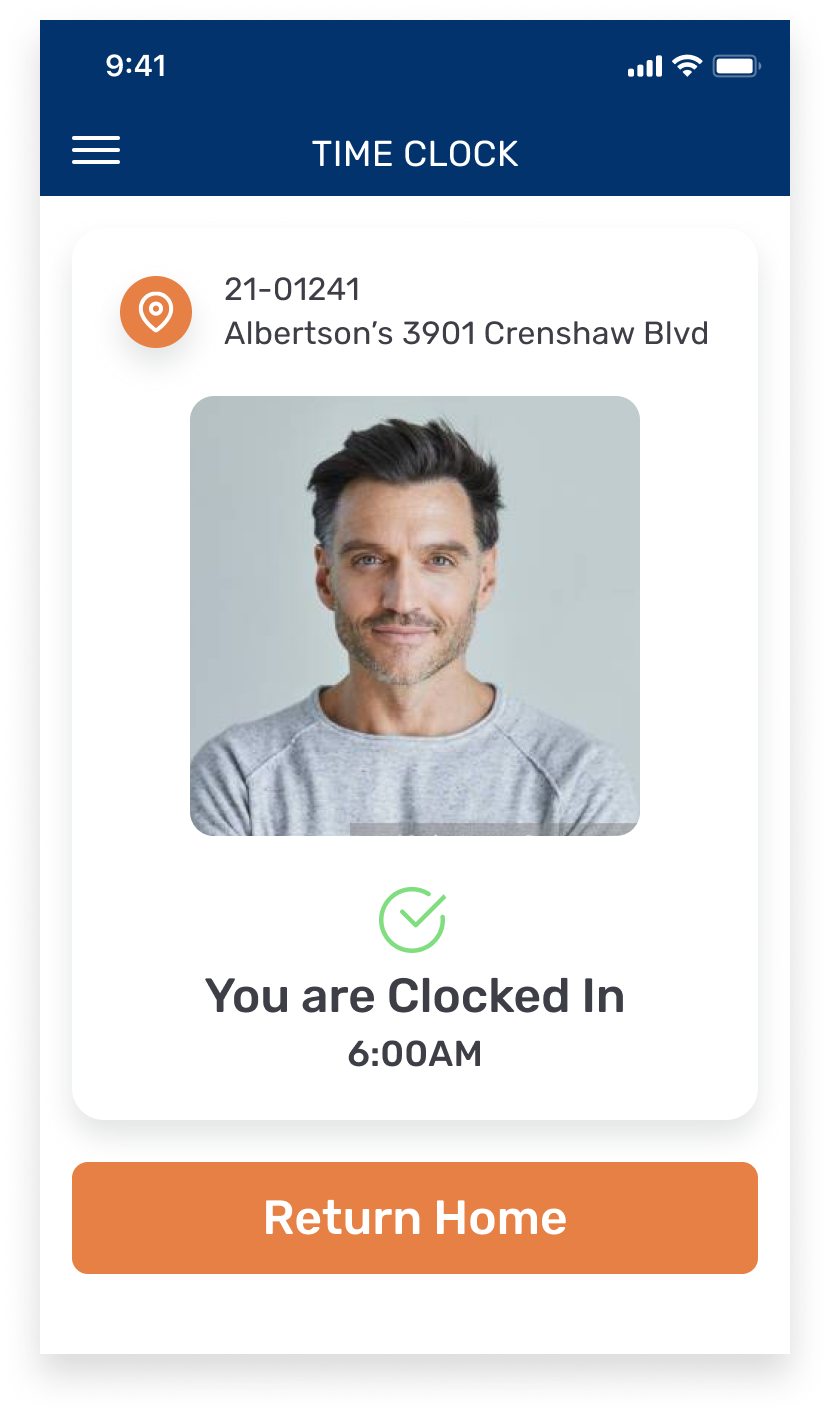
Geofencing
The mobile app uses geofencing to only show jobs within a certain radius of the crew member’s location, thereby reducing load times and the mistake of clocking-in to the wrong job.
Clock-In Confirmation
A confirmation screen after clocking-in appears in order to re-establish trust in the company’s time tracking system.
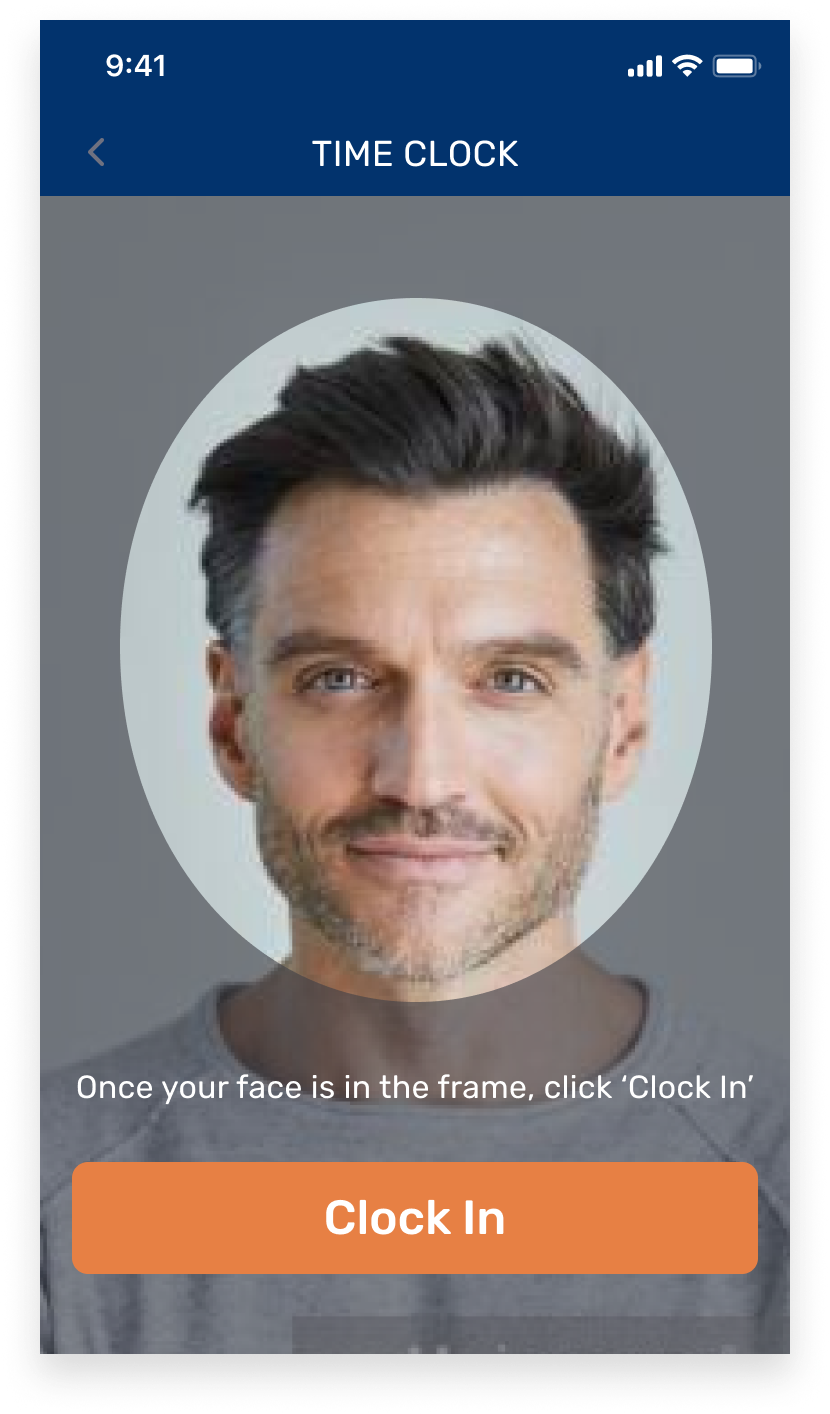
Image Capture
Image capture is used to verify the identity of the crew member. False clock-ins were a problem that the company faced before.
USER PAIN POINTS
Distrust in the current time clock has led to tedious record-keeping practices
Our team’s strategist and I interviewed 7 potential users about their roles and responsibilities, as well as pain points with the current time tracking software.
Crew Member
“I write everything because I don't trust the app. That is how I get paid....you never know.”
Foreman
“I don’t have access to anything. I only see my hours, but nothing about the guys. I used to use Excel. Now I use a notepad for myself and everyone. That is the only way I have to see who showed up, when, where... I normally have 15-20 guys to track.”
Admin
“I sometimes spend 8 hours a day on Fridays fixing time cards or manually inputting times.”
DESIGN PROCESS
Adapting the process to each product’s unique challenges
Because each user had different requirements, no single product followed the same design process. We were constrained by time and thus needed to choose which steps would warrant the biggest payoff towards the final design.
1. User Journey
We focused on the user journey of the Foreman, as they act as the middleman between the Admin and the Crew Member. This allowed us to get a birds-eye view for how all three products interacted with each other.
2. Information Architecture
With so much data being handled on the Admin side, building an Information Architecture map was imperative for validating information with the client. This document was also useful for the Development team, as they prepared to code the backend system while I focused on design.
PorterMatt’s Field Construction Admin walked me through the various tasks he completes on the current time clock software. I noticed that only 40% of all functions and data fields in the current system were used, which meant the new system could offer a radically simpler experience to complete all his tasks.
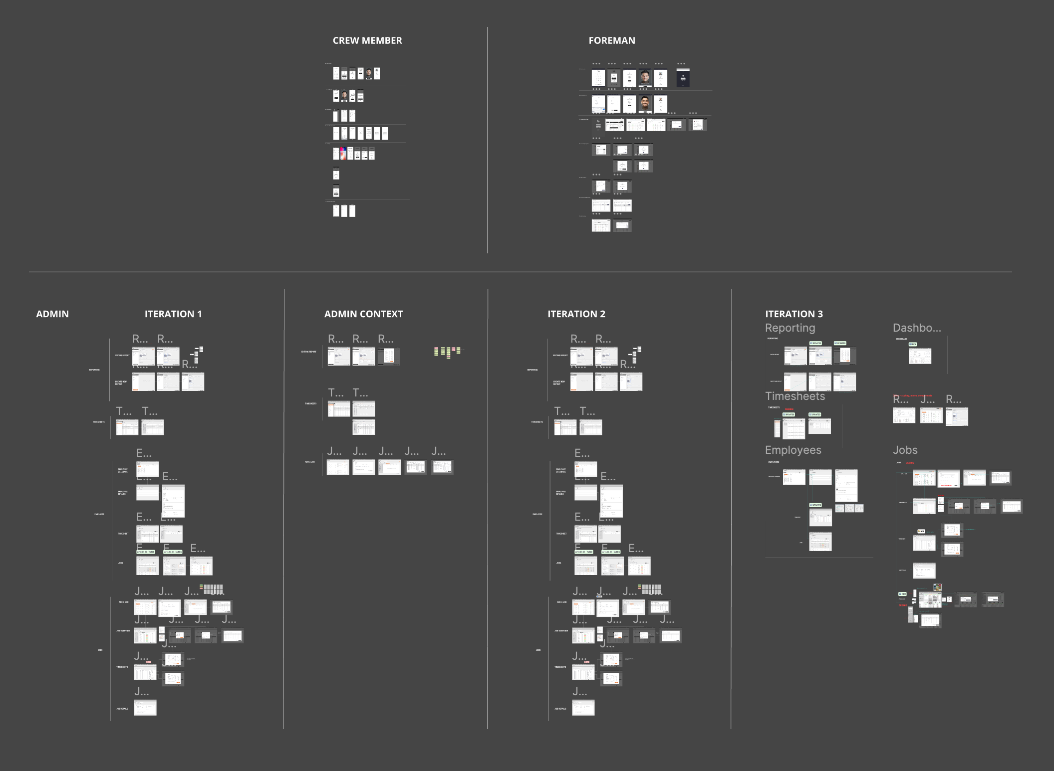
3. Wireframes
While wireframes were created for all three products, each took on a different approach. The Crew Member wireframes focused on the flow of the clock-in process, whereas the Foreman wireframes focused on the information displayed on each screen. Since the Admin requirements were significantly more complex than the other two, I wireframed only the key functions and made as many iterations as necessary until my design partner and I felt comfortable moving into hi-fi design.
4. High Fidelity Design
We took into consideration several factors when designing in high fidelity. Choosing high contrast colors was important as the Foreman and Crew Members would be out on the construction site, often with the sun shining against their screens. The users usually have weathered hands, so large buttons were needed. A helpful exercise my design partner and I did while creating components was to imagine that we were designing an app for children.
5. Usability Testing and Iteration
Once the Foreman and Crew Member apps were designed and prototyped in high fidelity, we tested key tasks with 3 Foremen and 3 Crew Members from PorterMatt. An interesting insight was that users below the age of 35 understood the design patterns and interactions more easily than those belonging to the over 35 age group. Our next round of iterations focused on radically simplifying the user experience on important tasks.
Version 1
Key Finding: The Job Overview screen was too overwhelming and the Foreman wanted to see their crew list immediately after login
Job Overview
Crew List
Iteration
We moved the crew list to the first tab and switched the layout from a table to cards with a scroll in order to show more members on the screen. We also changed the “Job Overview” tab to read “Pending Approvals” for increased specificity.
Crew List
Pending Approvals
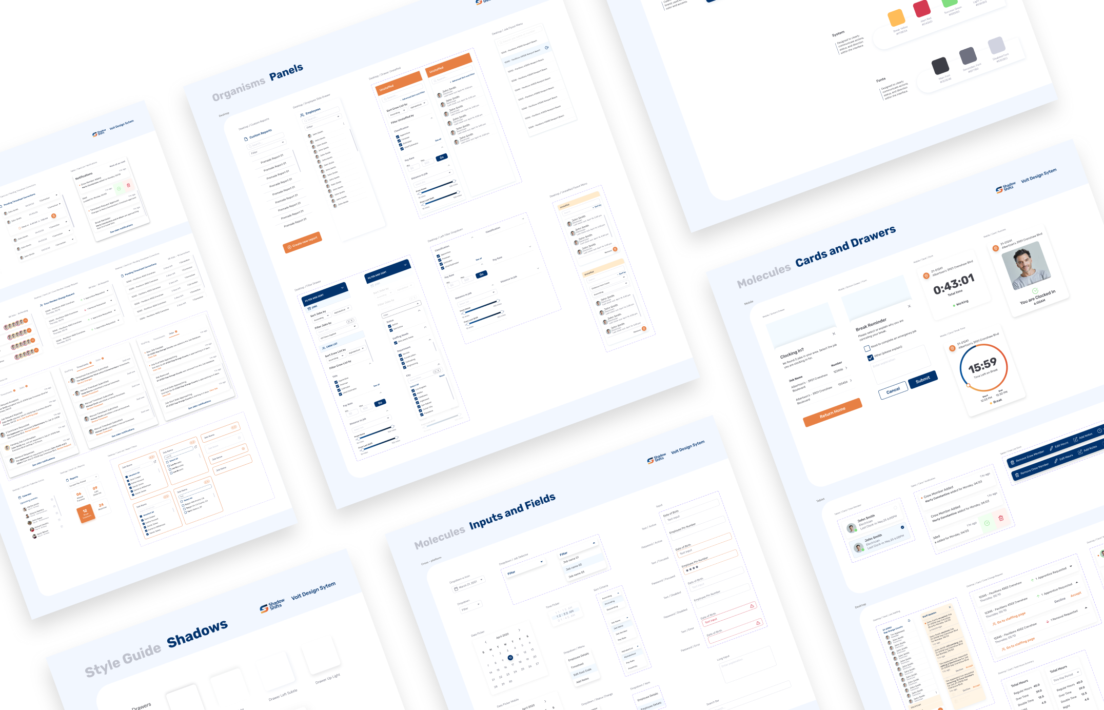
DESIGN SYSTEM
A design system that lends itself to obvious, accessible, and trustworthy interactions
I built the design system while working in the high fidelity design phase. We named the design system “Volt” as we wanted to weave the company’s electricity into the DNA of the system. Moreover, the Volt Design System integrates the company’s rough, strong, yet friendly and approachable personality into all of its components.
RETROSPECTIVE
1. Be aware of your knowns and unknowns
Due to a tight timeline before beginning development, I did not have the luxury of an extensive design process. I had to question whether each step would significantly move the needle in terms of getting to the final high fidelity design. If not, then I would need to bypass that step. Being aware of our knowns and unknowns was key to that decision-making process.
2. Developer constraints can be a good thing
The development team was added early in the design phase, which proved to be helpful in our ideation phase. By flagging technical constraints early, we were able to limit the possibilities and push design solutions forward.
3. My superpower lies in tackling complex features
With only three months to build three products, the supporting designer and I oftentimes needed to divide and conquer. I found that my main contribution was in rethinking the UX of a flow and turning a complicated user action into an elegant solution.
4. My creative confidence grew significantly
As the lead designer, I had to make the final decision on many key designs. The supporting designer noticed a visible increase in my creative confidence - that is, the natural ability to come up with new ideas and the courage to try them out (read more here). I believe this was due to working closely with another colleague and learning how to think about design from his perspective, in addition to my own.
The application is currently in development and scheduled to be completed in September 2021.