

Bringing government assistance closer to frontline heroes
MOBILE - ANDROID | JUSTICE & OPPORTUNITY
PROJECT OVERVIEW
SKILLS
Rapid prototyping
TEAM
3 Product Designers
TIMELINE
3 days (May 2020)
PLATFORM
Android
CHAN ZUCKERBERG INITIATIVE X ADOBE CREATIVE JAM
Adobe hosted a 3 day creative jam in partnership with the Chan Zuckerberg Initiative, an organization using technology to help solve some of our toughest challenges in education, justice & opportunity, and science.
CHALLENGE
Design a mobile experience that makes it easy for farmworkers to verify their identity, sign up for services like legal aid, healthcare, housing aid, counseling, and/or food distribution, and get access to timely and credible information.
RESULTS
Placed in the Top 20 among 90+ projects
PROBLEM
Signing up for government assistance is a complex and overly mechanized process
SOLUTION
A support system that treats farmers as more than just another number
We created virtual assistant Maria to be present at every step of a government assistance application, re-creating the critical human element in what is often seen as an extremely mechanized and confusing process.
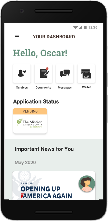
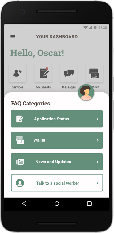
A home for the most relevant news and updates
A dashboard that cuts through the clutter and delivers what matters to users: their application statuses, documents, and timely news.
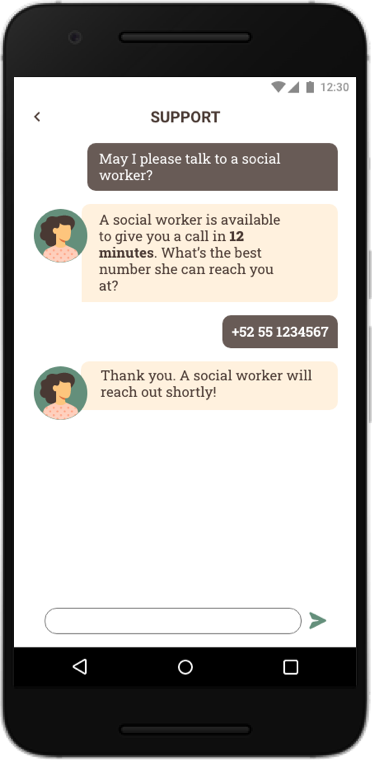
Talk to a real human being
Knowing the limitations of a chatbot, the HeyMaria app can quickly access a network of social workers to further assist a user.
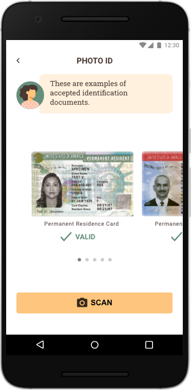
OCR technology to bypass in-person verification
With in-person verification deferred during the COVID-19 crisis, the app utilizes Optical Character Recognition (OCR) technology for verification. Maria walks the user step-by-step through the unfamiliar process.
Constant support right at your fingertips
Maria remains a permanent fixture on the dashboard to answer frequently asked questions and call upon a social worker if needed.
CONTEXT
Social workers are the critical human element bridging complex government services
Farmworkers play an essential role to the nation’s food supply. The vast majority of them are immigrants who do not qualify for government stimulus packages during the COVID-19 crisis, making access to safety net services an important goal. The New York Times covers the issue in depth here.
During the 3 day design challenge, we managed to interview a CalFresh/WIC recipient who informed us that social workers are the most helpful resource in connecting to safety net services. However, many social workers are referred through word of mouth, which makes them inaccessible to those without the right connections. My team decided to recreate the social worker experience through an app so that more users can tap into their expertise.
User Persona
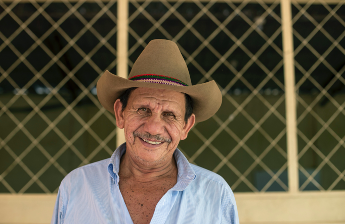
Oscar Antonio
An immigrant farmworker from Guadalajara, Mexico who now resides in Bakersfield, CA for seasonal work on a farm. He speaks Spanish and basic English.
GENERATIVE RESEARCH
A picnic in the graveyard: discovering where conversational UI can flourish
We asked ourselves, “how can we recreate the feeling of talking to a real social worker?” We allowed ourselves to be inspired by apps that have failed, also known as the Picnic in the Graveyard technique. An app that emerged during our brainstorming session was Quartz, a mobile news app that initially debuted with a chat interface and bots pre-fed with human prose.
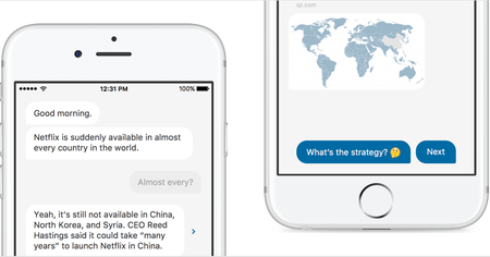
Though this approach didn’t quite work for Quartz, we saw merit in pre-filled responses for HeyMaria. Considering that English may be the user’s second language, pre-filled responses would significantly reduce cognitive load for the user as it is easier to read a list of options than to compose a response (see Memory Recognition and Recall in User Interfaces).
Conversational UI became the theme for our approach to onboarding and various screens throughout the app. We also wanted to keep the UX writing tone friendly and inviting to counterbalance the complicated process of applying for government assistance.
DELIVERABLES
Search Screens: Look for services by category and location
Users can quickly discover the most relevant services by entering their location and category. Since some farmworkers may have trouble reading, we used iconography and visuals to communicate information throughout the app.
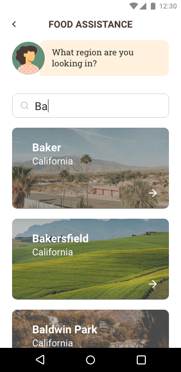
Location search
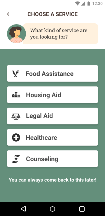
Service categories
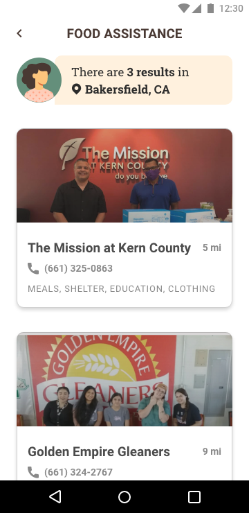
Search results
Verification Screens: Streamlined documentation process for current and future applications
We designed visuals to help users gather the right documents and quickly capture them for processing using OCR technology. Once captured, users can save time on future applications by saving these documents in their account.
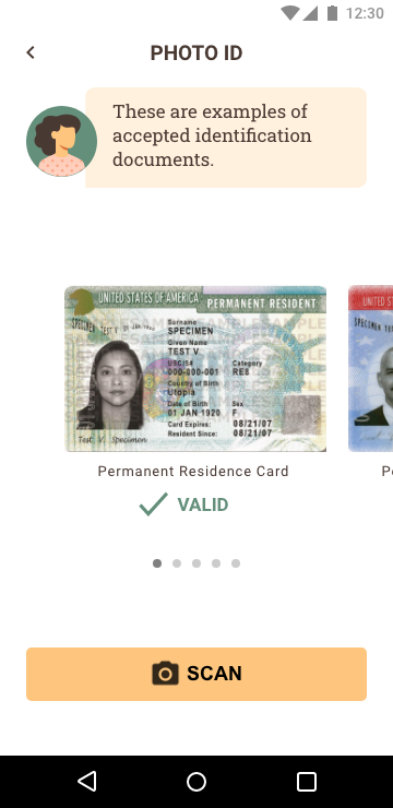
Verification Step 1
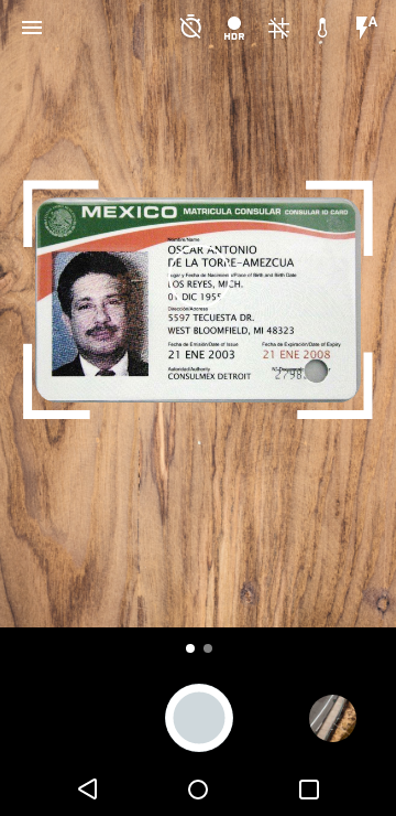
Verification Step 2
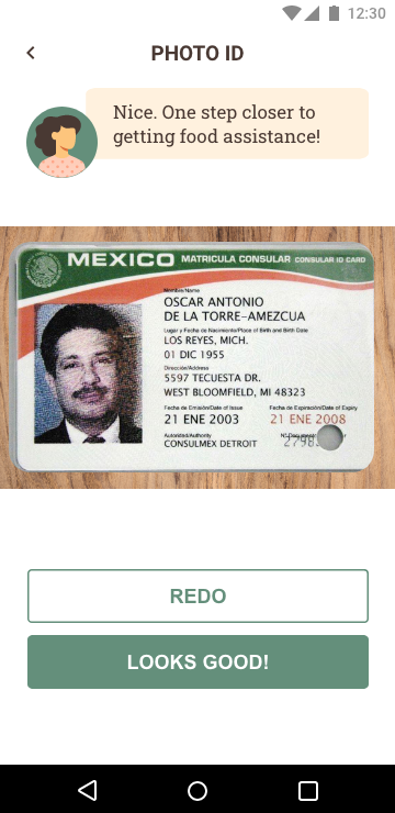
Verification Step 3
Dashboard Screens: Removing much of the guesswork when applying to and using safety net services
The dashboard shows the status of a user’s applications and delivers important and relevant news. Maria, the personal assistant, is a floating action button which reveals additional support and access to a network of social workers. But even after successfully applying for government assistance, there can be stringent rules for utilizing such services. The Wallet feature, then, helps users find critical information and documents needed to use certain services.
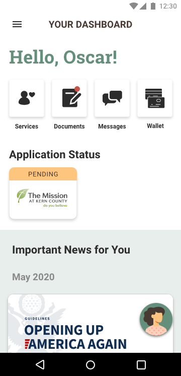
Dashboard
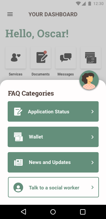
FAQ’s
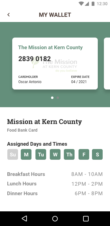
Digital Wallet
RESULTS AND RETROSPECTIVE
Work fast but don’t overlook the user’s needs
The biggest challenge was meeting the creative brief’s specific requirements yet creating an experience that could stand a sea of competition. Through insights uncovered with our interview subject and taking inspiration from past mobile apps, we were able to design with a real point of view and unique value proposition.
As a designer, I found that I greatly improved my rapid prototyping skills. With only 3 designers and 3 days, I learned to work fast and to be unafraid of making UI changes at the eleventh hour for the sake of better usability.
Our efforts certainly did not go unnoticed as we placed in the Top 20 among 90+ projects!