
Increasing demo-to-close conversion rates by streamlining decision-making
PRODUCT MANAGEMENT & DESIGN | WEB | B2B SAAS PLATFORM
PROJECT OVERVIEW
METHODS
Information Architecture
Feature Prioritization
User Stories
Customer Testing
TIMELINE
6 Weeks (Jan - Feb 2020)
CLIENT TEAM
Chief Product Officer
Head of Engineering
Development team
Lead Architect
ROLE
Team Co-Lead
(6 designers)
CLIENT
Aquila Clouds is an early-stage startup that provides cloud financial management solutions designed to slash costs, streamline billing, and lock down security across a company’s cloud environment.
CHALLENGE
The client needed a massive overhaul on the usability of its Cloud Cost and Performance dashboard to meet the organization’s goal of increasing demo-to-close conversion rates.
RESULTS
Aquila Clouds closed a deal with a major player in the Asia Pacific Region through a demo of the new prototype.
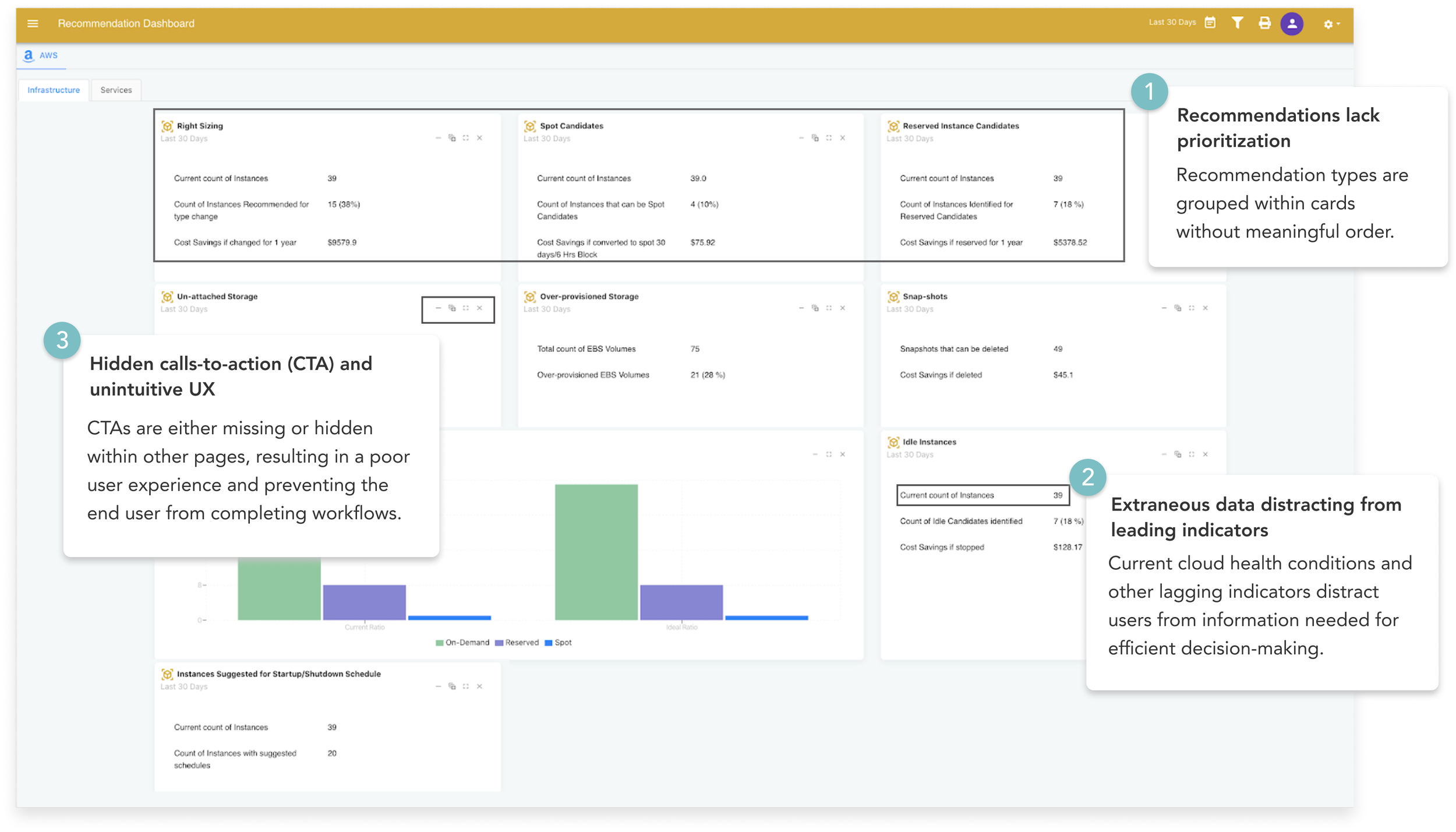
EXISTING PRODUCT
A confusing user interface leading to lost sales opportunities
The Cloud Cost and Performance dashboard had a fundamental usability problem: key features were hidden behind a confusing interface that prioritized lagging metrics over leading ones. DevOps managers couldn't see what they needed to act on, so demos stalled.
Before: Cloud Cost and Performance Dashboard
TECHNICAL RESEARCH
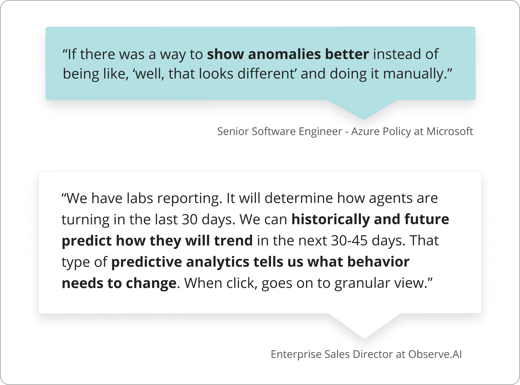
Without the technical knowledge of cloud platforms, I had to get smart fast. I interviewed 8 software engineers (2 in DevOps roles), signed up for 3 competitor demos, conducted UX audits on cloud computing dashboards, and looked at comparative industries for dashboard design inspiration.
The critical finding: competitors either front-loaded users with too much technical detail, or added unnecessary friction before letting users act on a recommendation. Neither was serving the workflow.
Primary Research
Secondary Research

RESCOPE
I led conversations with the Chief Product Officer and convinced him to consider a re-scope by sharing insights we had gathered from our primary and secondary research. Then, we proposed the following reframed question:
How might we deliver powerful, actionable recommendations to DevOps Managers so that they make data-driven decisions with confidence?
DESIGN PROCESS
Partnering with domain experts to get from the bare minimum to a delightfully useful product
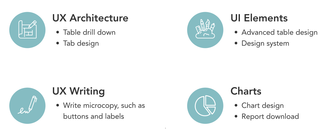
With only 4 weeks left for the client engagement, I had to organize my design team effectively. I used a divide and conquer approach, identifying the strengths of each team member and giving each person a sense of ownership over their domain. The four areas I identified and assigned each member to were the following:
Iteration 1: Getting the content right
Getting the information right took priority at this stage. A wireframe was used to validate the information and key actions with a former Infrastructure and DevOps Senior Director.
Iteration 2: Getting the pieces together
In this first hi fi version, I focused on testing the usability of the dashboard with a Senior Engineering Manager.
Iteration 3: Getting customers to close
I implemented alternative use cases as suggested by the Senior Engineering Manager and fleshed out the table functionalities, as these features would help drive value to prospective customers.
USER STORIES & FEATURE PRIORITIZATION
I wanted to crystallize these changes through writing user stories and prioritizing them. This would help convince product and engineering teams of our proposed changes, and ensure a smoother developer handoff. A few epics and user stories I wrote were:
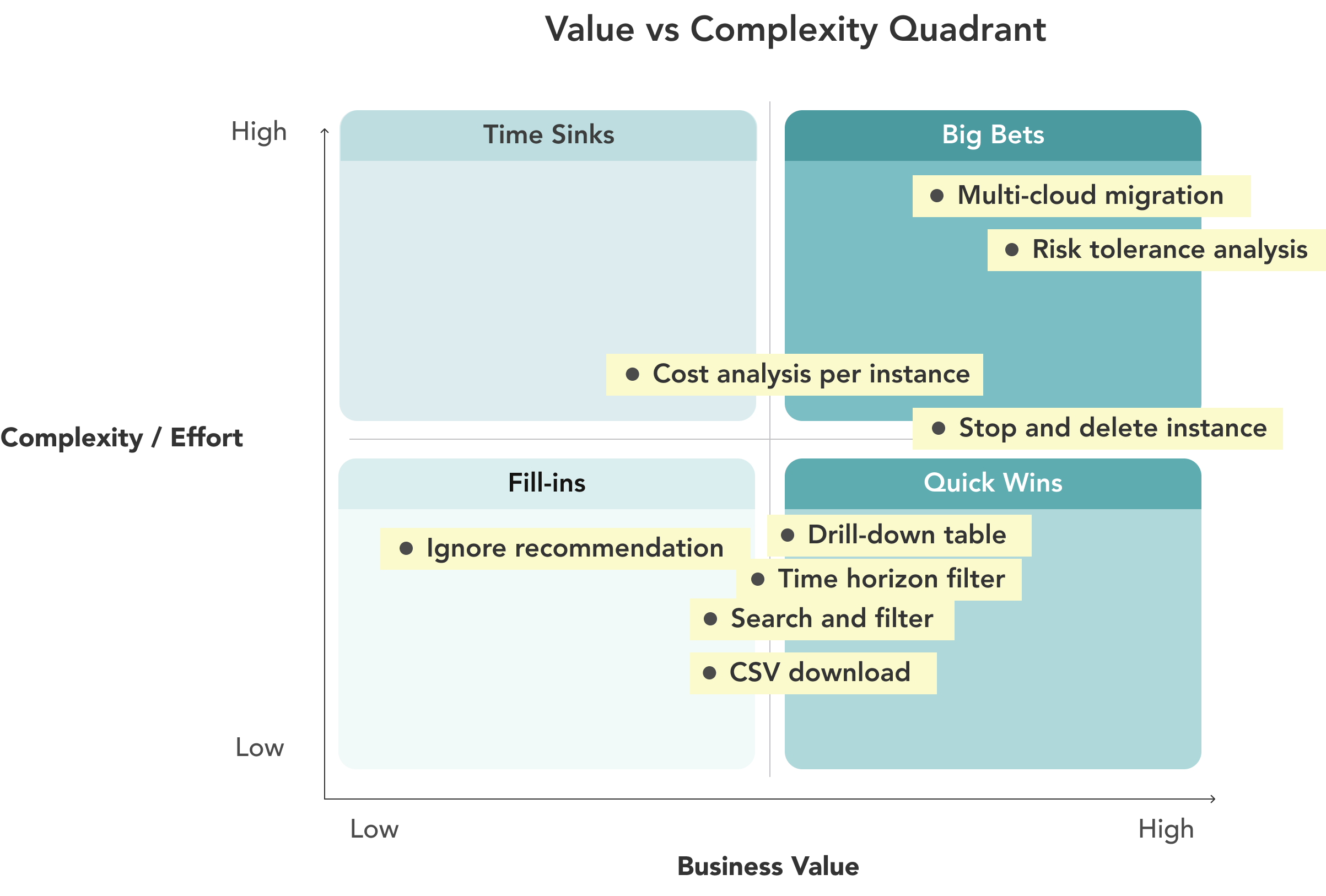
I prioritized features based on a Value vs Complexity Quadrant, which helped appropriately scope work for the engineering team:
OUTCOME
A dynamic dashboard that finally understands the DevOps Manager - and closing a deal with a major player in the Asia Pacific Region
Aquila Clouds showed the new demo to investors the next day. The prototype became the gold standard for customer demos and directly closed a deal with a major enterprise in the Asia Pacific region. Aquila Clouds also re-engaged my team for their Billing Operations product.
Update (2025): Aquila Clouds has since grown from 2 to 60+ global customers, built on the MVP, design system, and customer research delivered from this engagement.
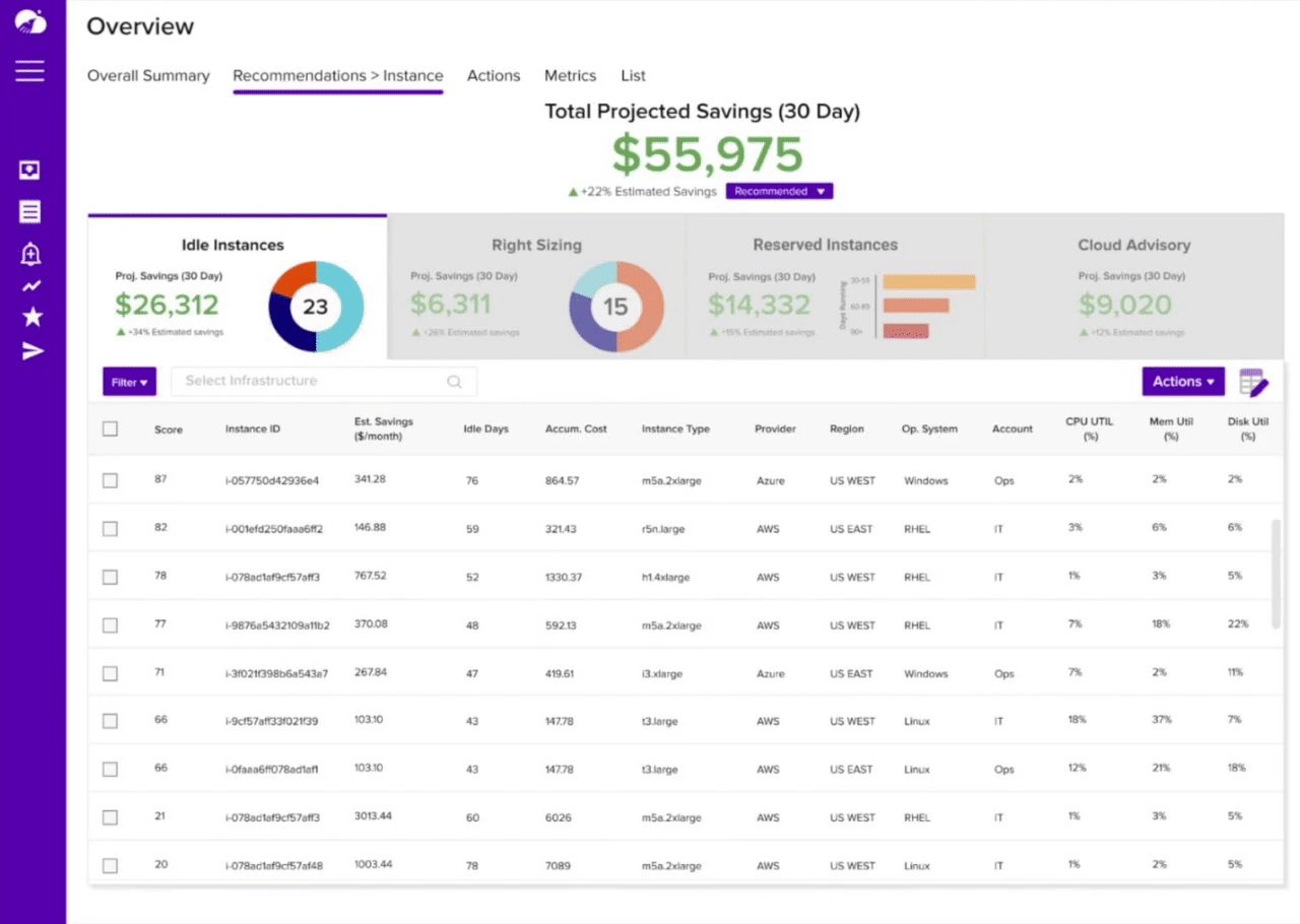
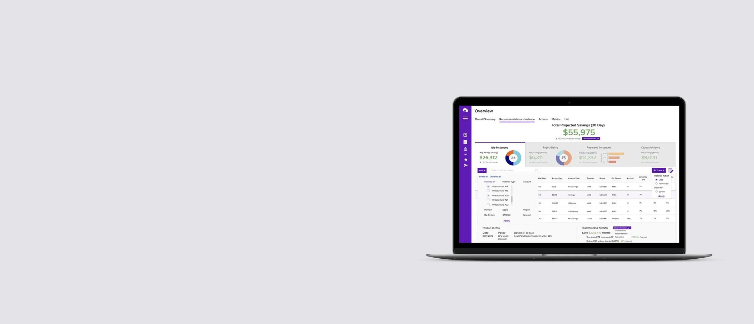
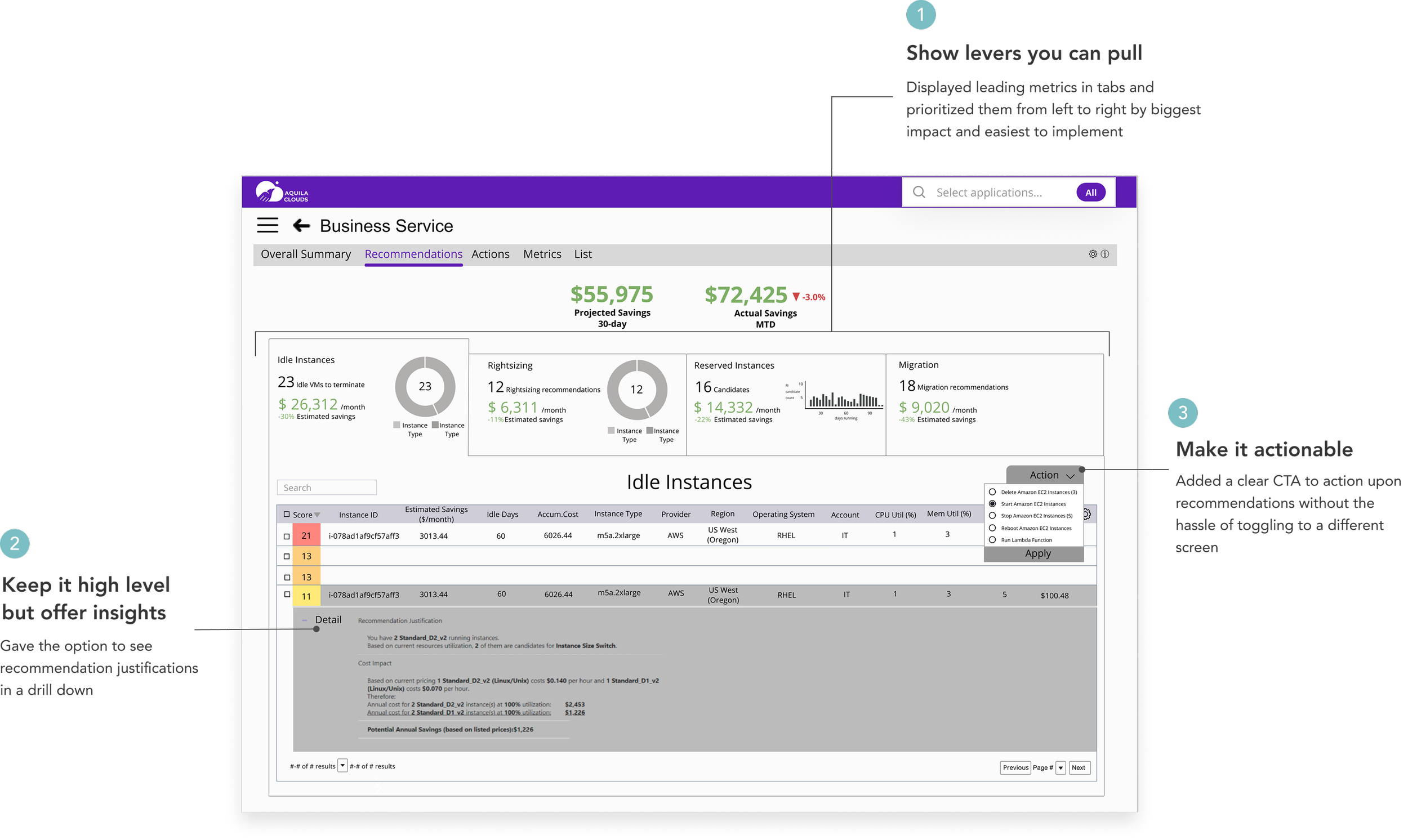
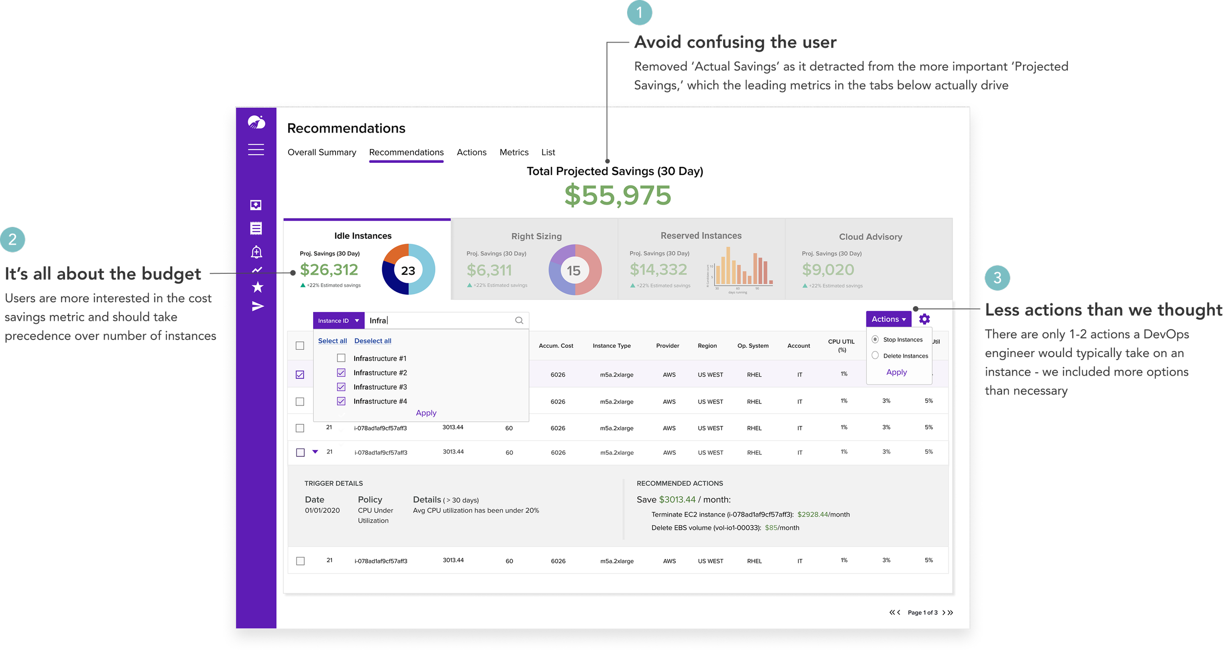
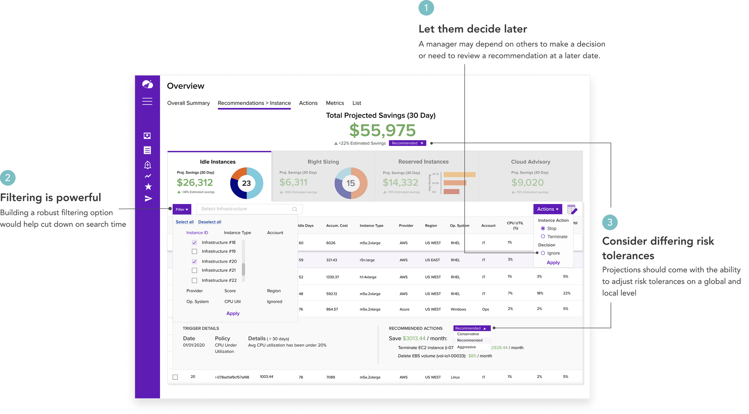
Used hierarchy to refocus user on goal of increasing savings, with leading metrics below in tabs
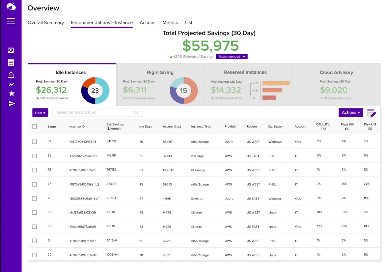
Included next steps in form of CTA’s directly on dashboard to prompt action
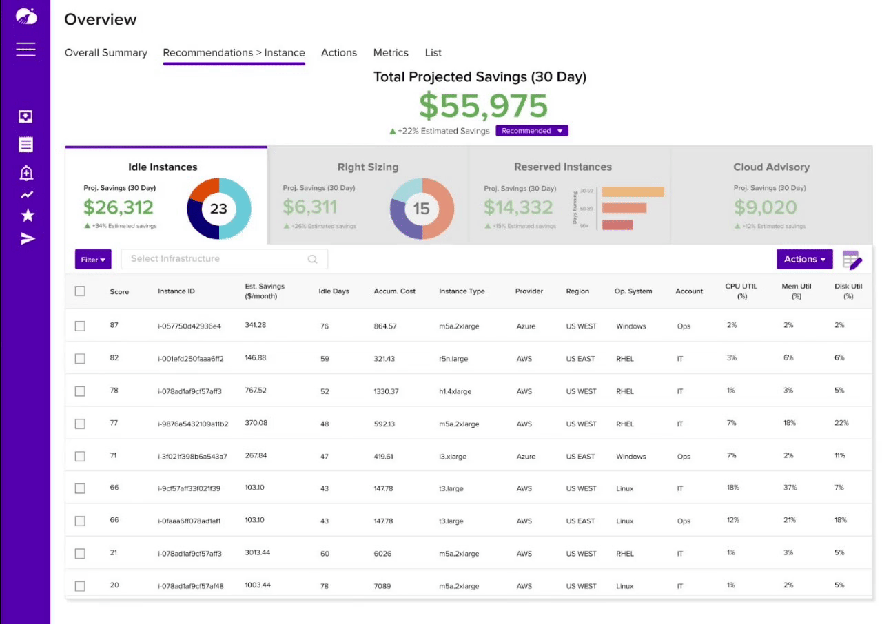
High level information shown by default, with option to drill down per row to inform decision-making
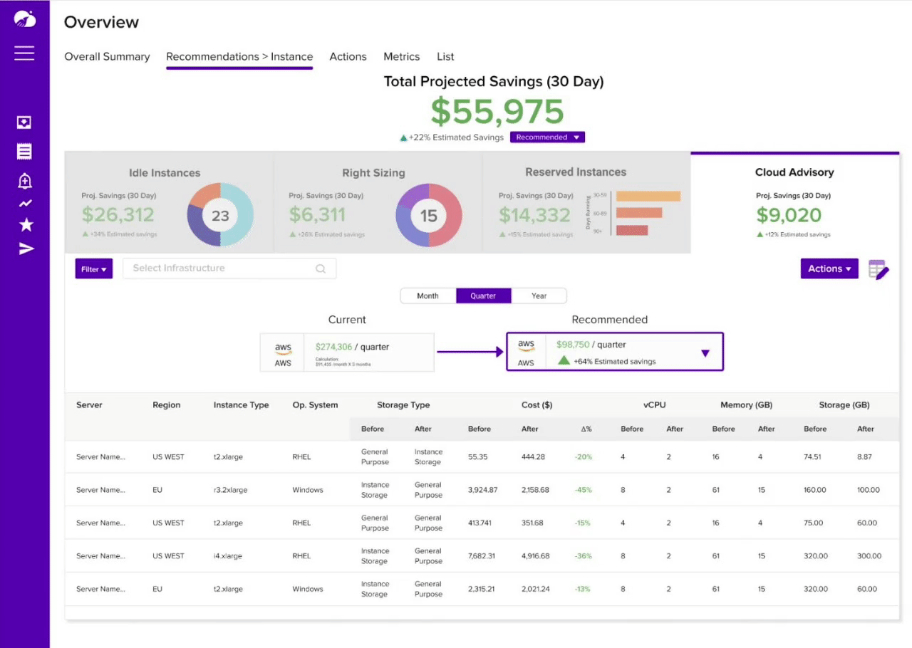
Table and time settings are customizable to meet the unique needs of an organization