

Streamlining decision-making for DevOps Managers
WEB | B2B SAAS PLATFORM
PROJECT OVERVIEW
METHODS
Research
Information Architecture
Testing
TIMELINE
6 Weeks (Jan - Feb 2020)
CATEGORY
B2B SaaS Platform
ROLE
Team Lead
CHALLENGE
Aquila Clouds needed a massive overhaul on the usability of its Cloud Cost and Performance dashboard to meet the organization’s goal of increasing demo-to-close conversion rates.
RESULTS
Presented dashboard re-design to executive team at Aquila Clouds
In development; prototype is being used in investor pitch
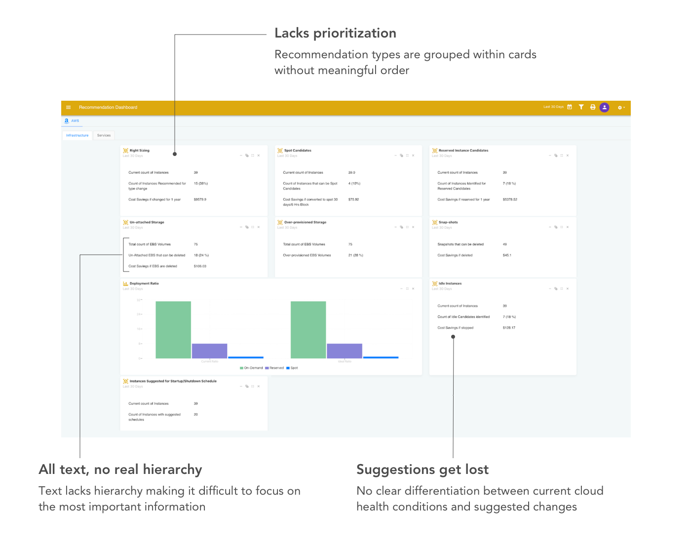
EXISTING PRODUCT
A confusing user interface leading to lost sales opportunities
Though there was overall positive feedback about the Aquila multi-cloud cost and performance management platform, potential customers were hesitant to close as they found much of the user interface confusing and showing lagging metrics rather than leading metrics.
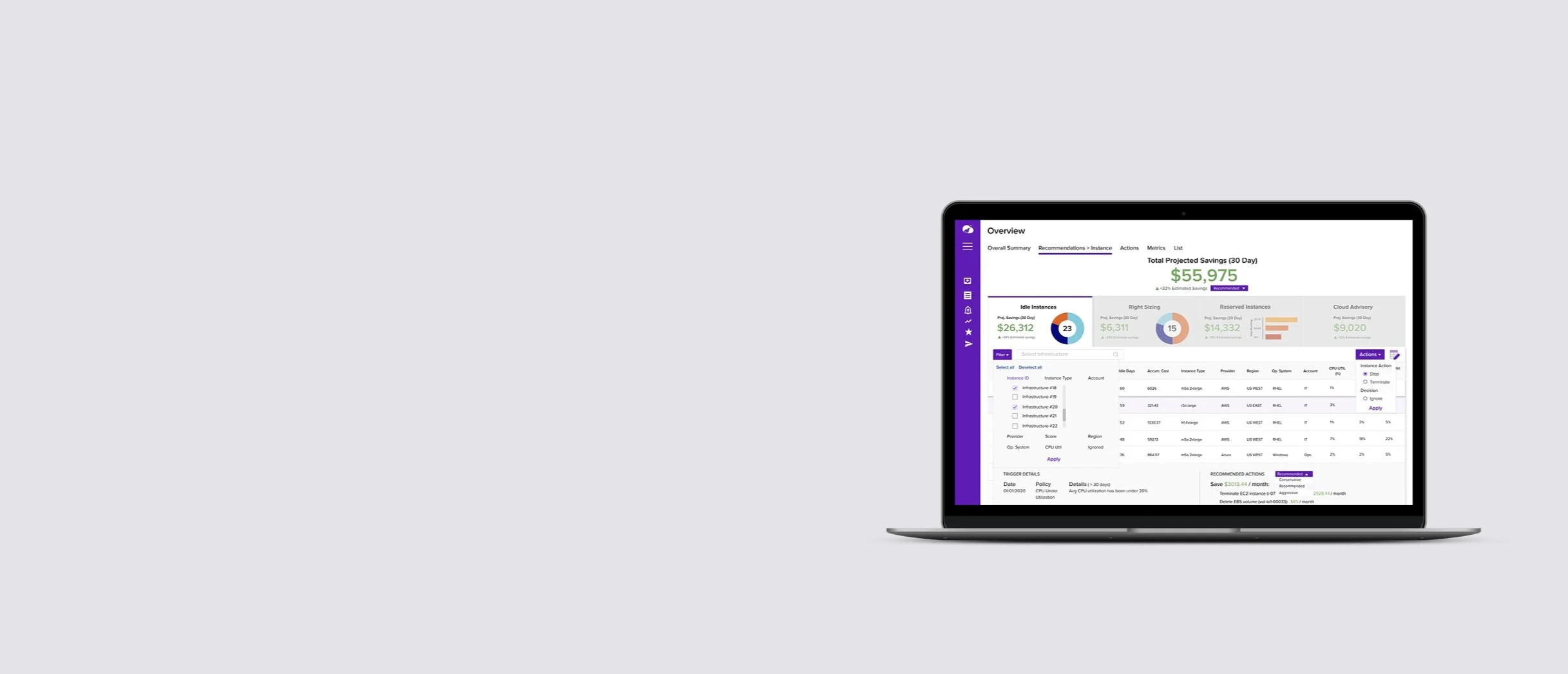
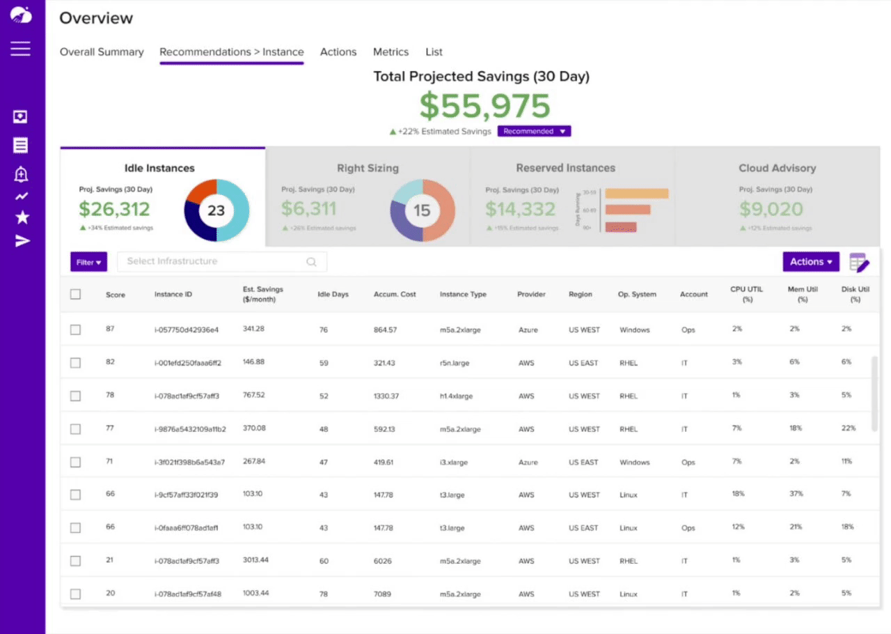
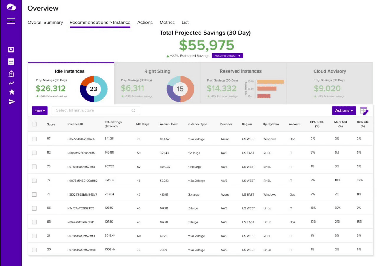
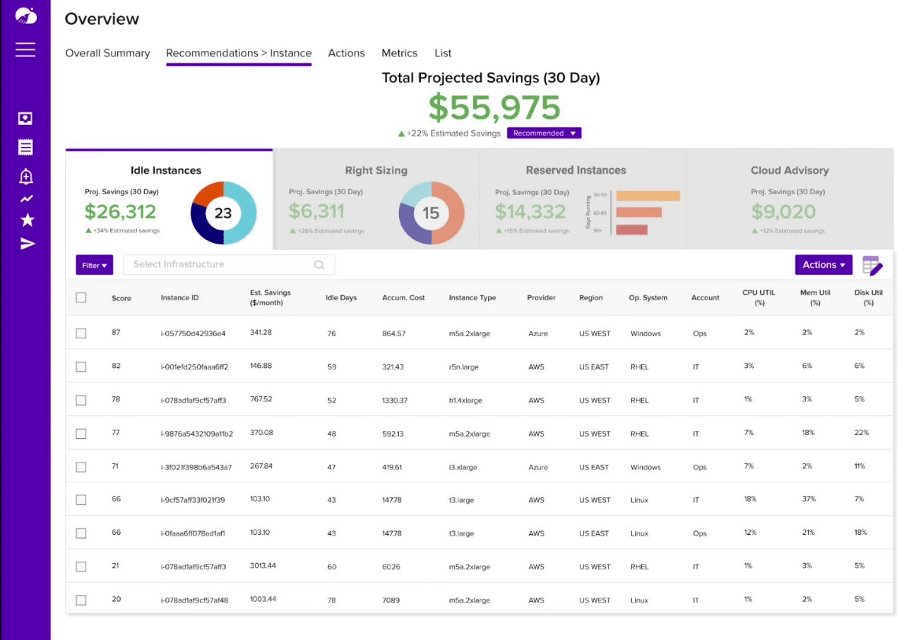
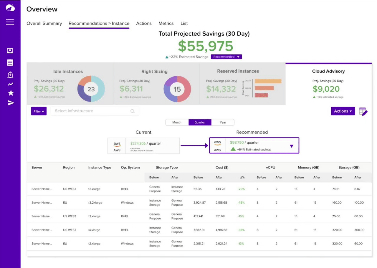
Cloud Cost and Performance Dashboard
SOLUTION
A dashboard that aligns with the DevOps manager’s workflow
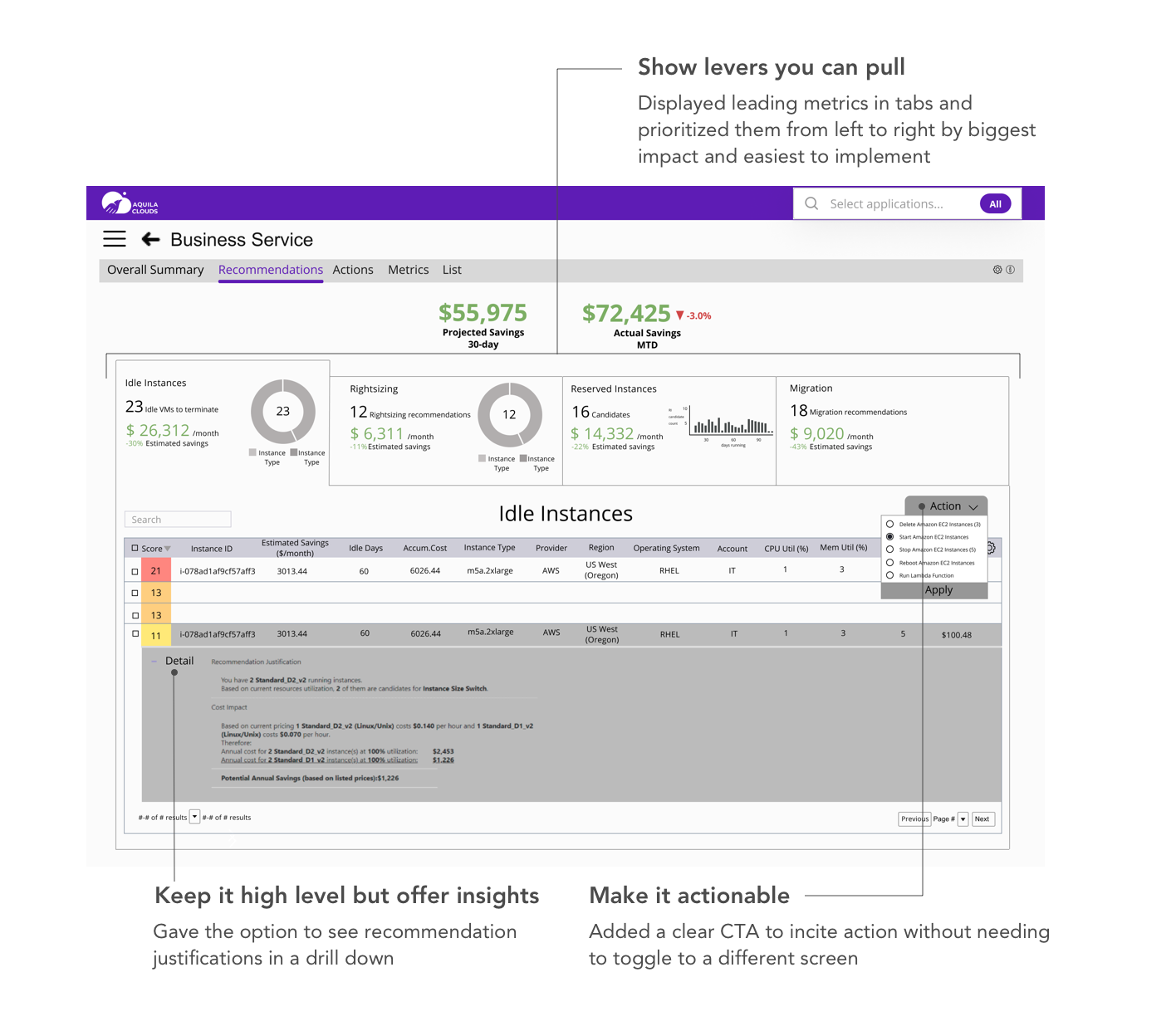
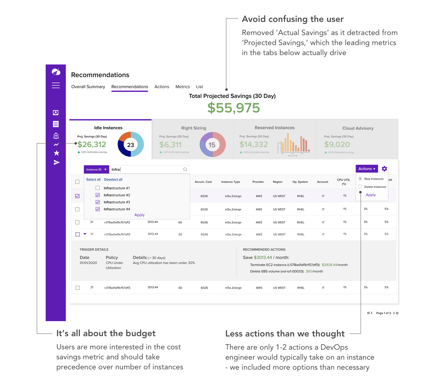
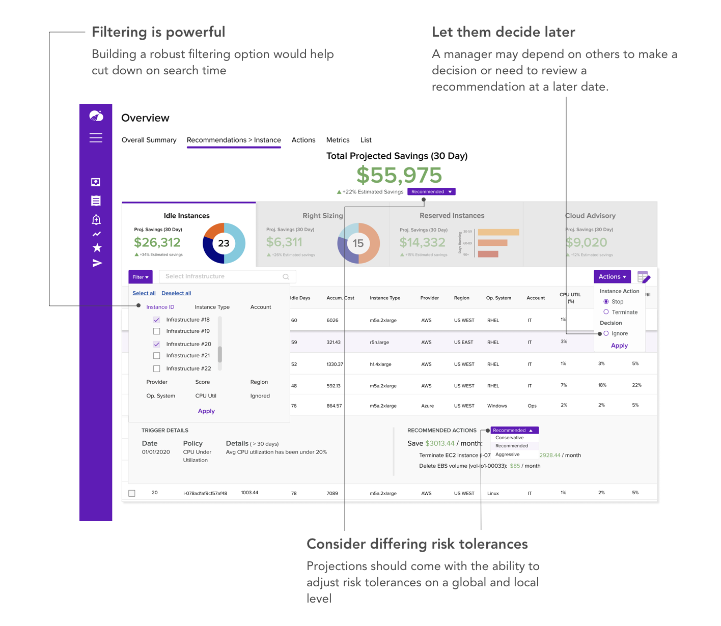
By prioritizing and adding hierarchy to important information, as well as adding CTA’s that allow for customizability and action, DevOps managers can optimize cloud usage more efficiently.
Focused on the goal
Used hierarchy to refocus user on goal of increasing savings, with leading metrics below in tabs
Prioritized information
High level information shown by default, with option to drill down per row to inform decision-making
Action-oriented
Included next steps in form of CTA’s directly on dashboard to prompt action
Customizable features
Table and time settings are customizable to meet the unique needs of an organization
TECHNICAL RESEARCH
Looking through multiple stakeholder lenses
Without the technical knowledge of cloud platforms, I had to get smart fast. I interviewed 8 software engineers (2 in DevOps roles), signed up for 3 competitor demos, conducted UX audits on cloud computing dashboards, and looked at comparative industries for dashboard design inspiration.

Competitors
Demos showed that some competitors default to front loading the user with too much technical detail, while others add unnecessary friction for users to act on a recommendation.
Cloud Computing Services
Auditing various cloud dashboards and documentation taught us the technical jargon and what metrics are important for a DevOps engineer.
Comparative: Finance
Budgeting and stock dashboards demonstrated best practices for showing relationship between leading and lagging metrics, as well as separating high-level and detailed information.
ITERATIONS
Partnering with domain experts to get from the bare minimum to a delightfully useful product
Wireframe: Getting the content right
Getting the information right took priority at this stage. A wireframe was used to validate the information and key actions with a former Infrastructure and DevOps Senior Director.
Hi Fi Version 1: Getting the pieces together
In this first hi fi version, I focused on testing the usability of the dashboard with a Senior Engineering Manager.
Hi Fi Version 2: Getting customers to close
I implemented alternative use cases as suggested by the Senior Engineering Manager and fleshed out the table functionalities, as these features would help drive value to prospective customers.
FINAL PROTOTYPE
A dynamic dashboard that finally understands the DevOps Manager
Aquila Clouds saw missed sales opportunities because its Cloud Cost and Performance dashboard insights were hidden behind a confusing interface. I designed a more dynamic dashboard to align with what DevOps managers need to follow through with Aquila’s recommendations.
Before
After
FEEDBACK
The dashboard was such a hit, Aquila Clouds showed it to potential investors the next day
Taking time to look in-depth at current competitor offerings, validate each design iteration with senior engineers, and make strategic decisions based on research paid off. Aquila Clouds was impressed and chose to forego their current demo and show our prototype for an investor pitch the next day!
RETROSPECTIVE
Challenge what customers think they want and design for what they actually need
This wasn’t what the client asked for…
Initially the client asked to make the content within the cards (of several dashboards) more visually appealing, as this was the biggest feedback from potential customers. Through several interviews, I learned that what customers really want is clear information and action steps. Considering that Aquila is a start up currently focused on customer acquisition, I worked with the co-founder to rescope the project for the Cloud Cost and Performance dashboard - the key driver for the business and its customers.
My next plan of action: more testing!
While I was able to validate designs with engineers at every iteration, I would like to conduct more user tests to uncover points of friction in the user’s workflow. Additionally, gathering more perspectives would unveil missing information and use cases that should be factored into the design.